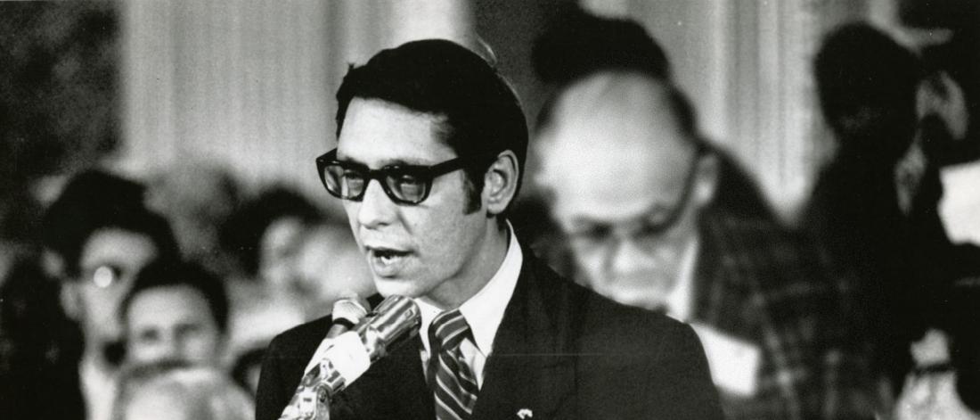
Black and white image of Izzy Asper, Asper School of Business.
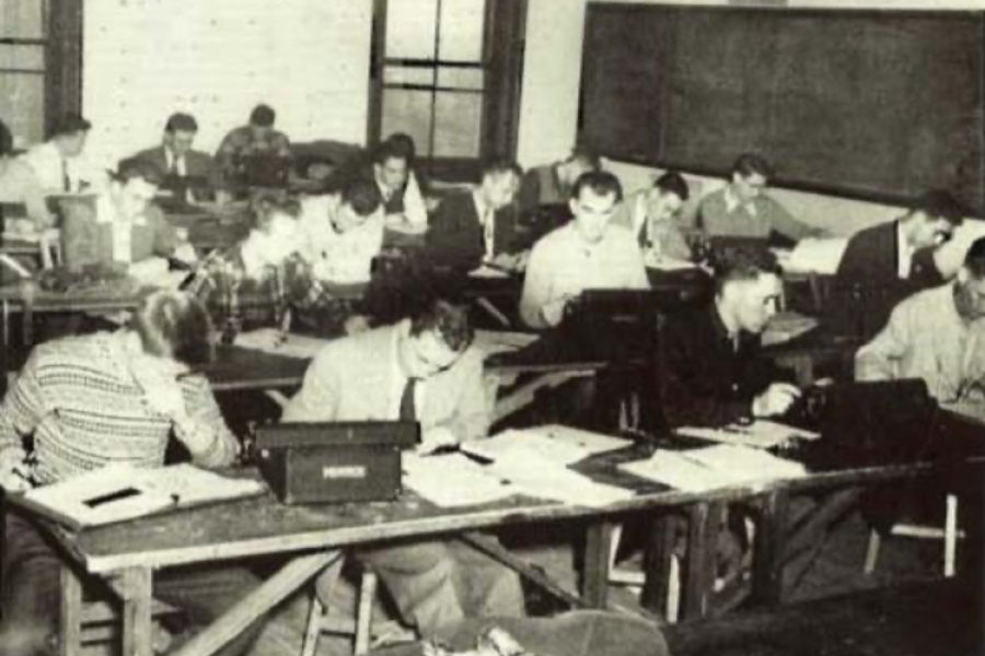
  • At the University of Manitoba, a business degree program was first offered in the 1937-38 academic year. Back then, commerce classes were held on the top two floors of the Arts Building, now the Tier Building, with the overflow accommodated on the third floor of the Administration Building. Classes were also taken in a skating rink that served as the University’s hockey rink until it was converted into classrooms for use by various units. The School of Commerce lead a nomadic life around campus until 1987 when it settled permanently in the Drake Centre.

    In its infancy, the program was predominantly taken by male students; the first woman to graduate in Commerce at the University of Manitoba was Phyllis Hutchings in April 1940. Hutchings’ motives were questioned by many, as it was thought that her pursuits were a waste of time if she were to get married and have children prior to graduation. Following graduation, Hutchings got married and went on to get a Master’s in Commerce from Queen’s. She countered her onlookers by replying: “Well then, I can assure my husband interesting dinner conversations.”

  • Black and white photo of all male commerce class.

From symbols, crests, to chevrons

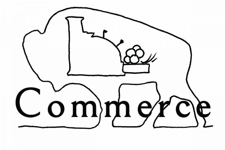
  • Outline of a bison with a cash register in it. The word Commerce is across the middle. Asper School of Business.

    1955

    The earliest official use of a Commerce logo can be found in the 1955 Brown and Gold yearbook. It appears as a header on the pages containing the Commerce graduates and sporadically in later editions. The use of a cash register can also be found in parade floats, snow sculptures, and on the covers of the CSA magazine, Enterprise.

  • Outline of an old Asper School of Business logo that says commerce, integrity, and enterprise. There is a small bison on the top and a big sail boat on the water.

    1960

    The class of 1960 initiated the official Commerce crest pictured above. Asper School of Business Professor, John Mundie, recalls that it was designed by Commerce Director, Ralph Harris. Apparently, Harris was unhappy with the logo at the time, but his sketch was rarely used. Although it was used on the graduating class composites for 1960, ‘61, and ‘62.

  • An old Asper School of Business logo that says Commerce and U of M. There is a bison on the top and a big sail boat.

    1968

    In 1968 a new crest appeared on the cover of the Grad Booklet through 1972. Right away the similarities between this crest and the one designed by Harris are undeniable. Similar to the crest before it, this version was rarely used. It’s suspected that because the faculty’s named changed to Administrative Studies in 1972 that the Commerce Crest would have no longer been appropriate.

  • An eighties style square box that was an old Asper School of Business logo.

    1972

    With the change of name, there also appeared to be a desire to change the logo. The Enterprise contained a brief article that fall presenting the new logo with an explanation of how it was develop and what is symbolized. The article implied that over the summer of group of students came up with the design stating, “ [the logo] indicated the interrelationship between all facets of business education.” The logo was designed by Harold Friesen, a student at the School of Art.

    The design is said to, “represent the interaction, coordination, and mobility of the four patterns of Commerce within society.” Unfortunately, there is no reference as to what those four patterns are. Like logos before, it was not very popular and rarely used.

  • Three blue chevrons with a grey and black outline.

    1985

    While there was often talk about what the arrows stood for, the chevrons first appeared in 1983 and included blue which was considered to be an important attribute of the logo at the time. The logo was used consistently and frequently in many aspects of the Faculty’s activities – stationary, student clothing, signage, etc. It quickly became a recognized symbol of the Faculty.

  • Asper School of Business logo in black font with a red circle that has arrows in the middle.

    2000

    When the Faculty of Management was named the I.H. Asper School of Business in 2000, it was appropriate to change the logo as well. With the help of a small committee, Barry Hammond of Flamingo Design was given the task of designing a new logo that reminiscent of the past, but was sufficiently different to communicate change. After only a month, a new logo was created.

The Drake Centre

New beginnings on 181 Freedman Crescent.

  • The Race for Space was born to raise awareness for the need of a dedicated commerce building. The Race, held for three years from 1982-84, involved a 10 km run mostly around the campus and raised about $50,000. While this was not enough money to construct a building, the Race generated local and national publicity. It raised profile of the need for the space and showed commitment at student level.

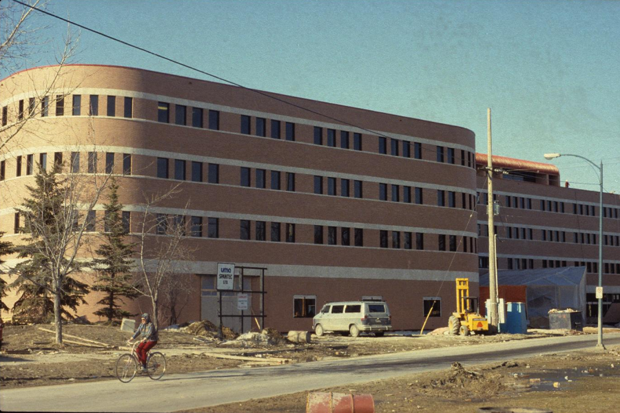
    The Drake Centre got its name from Bill Pollock [BComm(Hons)/49], Founder and Chair of Drake International, who gifted $1.5 million to repay the $150 scholarship he received in 1946, without which he would never have been able to attend university. He wanted the building named after his company, not himself. Designed by architect Etienne Gaboury and opened in 1987, the Drake Centre continues to be the home of the I.H. Asper School of Business today.

  • A grainy colour photo of the Drake Building being constructed in the 1980's. It appears to be srping.